6 minutes
Better Visualizations with Python - Zooming into Figures with Matplotlib

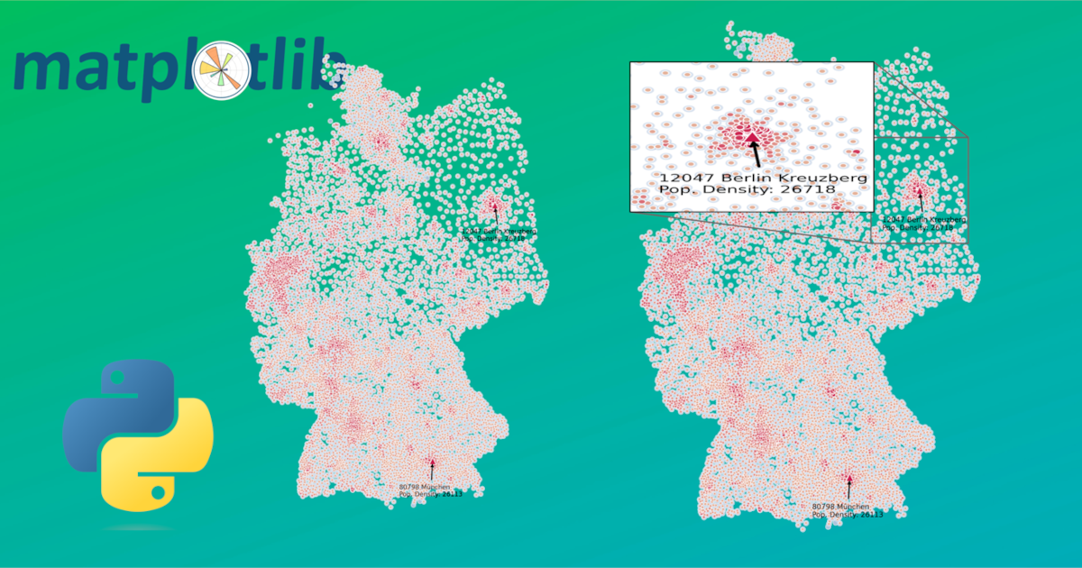
This step-by-step tutorial will showcase an example of calculating and plotting population density in Germany and walk you through the steps you need to carry out to achieve a nice zoom into your matplotlib figure.
You can also download the source code and follow the jupyter notebook in there from here .
Getting the Data
First of all let’s get ourselves a nice dataset and plot it, which will illustrates how valuable zooming into an otherwise chaotic plot can be.
The dataset plz_einwohner.csv can be downloaded here
.
To set up a clean Python development environment we can make use of a virtual environment and install the required dependencies in it without polluting our whole system:
python3 -m venv .venv
source .venv/bin/activate
pip install pandas matplotlib seaborn numpy
Now in our Python script let’s import all the modules that we are going to use for this project:
# for the data and plotting
import matplotlib.pyplot as plt
import pandas as pd
import seaborn as sns
import numpy as np

# for the zooming
from PIL import Image
from mpl_toolkits.axes_grid1.inset_locator import zoomed_inset_axes
from mpl_toolkits.axes_grid1.inset_locator import mark_inset
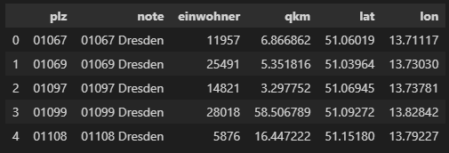
To read and get a glimpse of the downloaded dataset we can make use of pandas:
df = pd.read_csv("plz_einwohner.csv", dtype={"plz": str})
df.head()

Data Preparation
Let’s now make use of the einwohner (inhabitants) and the qkm (km²) columns to calculate the dichte (population density) column. For this we simply divide the number of inhabitants by the area (and cast the result to an integer to get rid of decimals) like so:
# only plzs with more than 500 inhabitants
df_selected = df.loc[df["einwohner"]>500].copy(deep=True)

df_selected["dichte"] = df_selected["einwohner"].div(df_selected["qkm"]).astype(int)
df_selected.head()
Plotting the Data
Now comes the more tricky part, which I wanted to share in this article - the plotting and zooming. We start off by initiating our figure and axes - I like to disable the axis for this plot to make it look more pretty. Remember the ratio for the figure as we are going to need it later.
ratio = (4, 6)
fig = plt.figure(frameon=True)
fig.set_size_inches(*ratio)
axes = plt.Axes(fig, [0, 0, 1, 1])
axes.set_axis_off()
fig.add_axes(axes)
Next up I want to prepare the colors, that I want to use in my plot. Of course you can also simply use preconfigured colours. For a nice gradient hue in the colors of the markers I like to define the colors of the two extremes (lowest and highest) and let the script calculate the colors for everything in between.
color_lowest = (0.9, 0.7, 0.6) # this is orange
color_highest = (0.8, 0.1, 0.3) # this is red

# this calculates all the colours in between orange and red to represent the different population density values that we have in our dataset
r = np.linspace(color_lowest[0], color_highest[0], num=len(df_selected["dichte"].unique()))
g = np.linspace(color_lowest[1], color_highest[1], num=len(df_selected["dichte"].unique()))
b = np.linspace(color_lowest[2], color_highest[2], num=len(df_selected["dichte"].unique()))

cust_palette = [item for item in zip(r,g,b)]
Plotting, Annotating and Zooming the Figure
Now for the actual plotting we make use of the seaborn library (an extension of matplotlib) and its scatterplot functionality using our custom colour palette.
# let's plot the population density over our previous plot and use our custom color palette
sns.scatterplot(ax=axes, x=df_selected['lon'], y=df_selected['lat'], size=abs(df_selected["dichte"]), alpha=1, marker='.', hue=abs(df_selected["dichte"]), palette=cust_palette, legend=False)
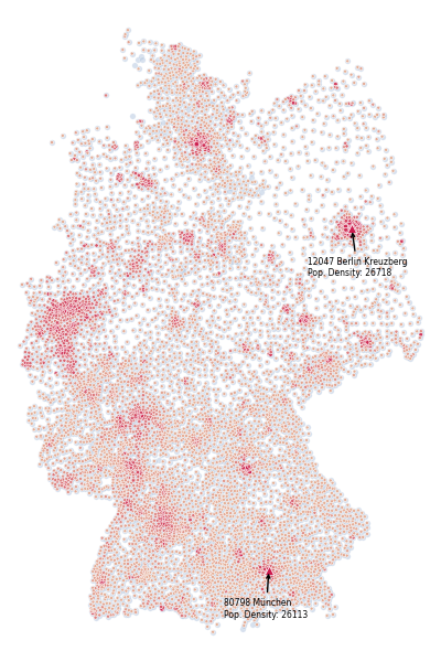
Now let’s say we wanted to additionally highlight the top two zip codes that have the highest population density in Germany. For this we sort our dataframe and select the top two entries and plot them using a different marker. Maybe we also want to annotate those two zip codes. These following code does exactly this and additionally saves the figure with hight quality in the end.
df_top = df_selected.sort_values("dichte", ascending=False).head(2)

sns.scatterplot(ax=axes, x=df_top['lon'], y=df_top['lat'], alpha=1, marker='^', color=color_highest, legend=False)

# annotate the two highest density plzs
for i in range(len(df_top)):
    row = df_top.iloc[i]
    xy = (row.lon, row.lat)
    # let's safe the highest values for later
    if i == 0:
        xy_top = xy
    axes.annotate(f"{row.note}\nPop. Density: {row.dichte}", xy=xy, xytext=(xy[0]-1, xy[1]-.6), fontsize=5.5, arrowprops=dict(arrowstyle="->", facecolor='black'))

fig.savefig(f"tmp.png", pad_inches=0, dpi=600, Transparent=False) # change transparency to your liking

Finetuning and Zooming
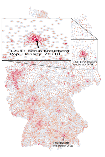
Now this is already looking quite nice I think, but for better readability of the plot, I would like to zoom into the highest density region. This part gets a little bit tricky but what basically happens is this:
- We configure the extent of the area, that we want to zoom into (this is trial and error to be honest -> see longitude and latitude of the zip code and add some padding)
zoomed_lon_range = [xy_top[0]-1.3, xy_top[0]+1.3]
zoomed_lat_range = [xy_top[1]-.8, xy_top[1]+.8]

extent = (zoomed_lon_range[0], zoomed_lon_range[1], zoomed_lat_range[0], zoomed_lat_range[1])
- Load and prepare the previously saved image
img = Image.open(f"tmp.png")
img.load()

# save the image as a multidimensional numpy array / matrix containing ints
data = np.asarray(img, dtype="int32")
# we have to reverse the order of the rows of our matrix as PIL will read it in reverse
data = np.flip(data, axis=0)
- The tricky part: compute a factor that let’s us convert the old figure dimensions into the new dimensions of the loaded image. In other words we want a mapping that tells us what the range of values in the old figure (
longitude: ~5.5-15.4, latitude: ~47-55.4) is translated to the range of the newly loaded image (the matrix dimensions -x: 0-2400, y: 0-3600;2400/3600is our previously defined ratio for the initial figure (4/6) by the way, which is of course maintained in the saved image).
# range of the old figure
lon_range = list(axes.get_xlim()) # [5.535051, 15.429309]
lat_range = list(axes.get_ylim()) # [46.988626999999994, 55.397533]

# the next two lines create vectors with the length of our loaded image data array that contain values ranging within the previously computed longitude, latitude ranges
lon_to_x_idx = np.linspace(lon_range[0], lon_range[1], num=len(data[0]))
lat_to_y_idx = np.linspace(lat_range[0], lat_range[1], num=len(data))

# with these we can easily get the index for the longitude/latitude values of our zoomed frame using the argmin function which gives us the index of the value that is closest to the zoomed value
# the index is just the counterpart/translation of that longitude/latitude in the newly loaded image data array
x_idx_start = np.absolute(lon_to_x_idx-zoomed_lon_range[0]).argmin()
x_idx_end = np.absolute(lon_to_x_idx-zoomed_lon_range[1]).argmin()
# do the same for y / latitude
y_idx_start = np.absolute(lat_to_y_idx-zoomed_lat_range[0]).argmin()
y_idx_end = np.absolute(lat_to_y_idx-zoomed_lat_range[1]).argmin()
- And lastly we just add the zoomed frame to our axes using the matplotlib toolkit functions
zoomed_inset_axesandmark_inset.
# let's configure the zoom with the newly computed values
axins = zoomed_inset_axes(axes, zoom=2.5, loc=2)
axins.imshow(data[y_idx_start:y_idx_end, x_idx_start:x_idx_end, :], extent=extent, origin="lower")

mark_inset(axes, axins, loc1=1, loc2=3, ec=".4")

# to hide axes from zoomed frame
axins.axes.xaxis.set_visible(False)
axins.axes.yaxis.set_visible(False)

fig.savefig(f"output.png", pad_inches=0, dpi=600, transparent=False) # change transparency to your liking

And with that we have created ourselves a nice and compelling plot by integrating a zoomed frame into our figure. I hope this helped!